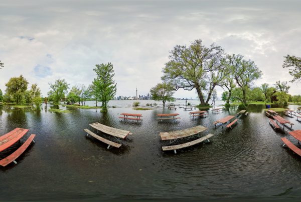
The recent inundation of the Toronto Islands has been a shocking reminder of their vulnerability. This spring saw the worst flooding in years due to some severe rainfall and above-average lake levels. Island ferries remain closed to non-residents and the city has cancelled all island permits until at least July 31. A walk — or wade — around the island this past month would reveal near-deserted flooded pathways and lawns with walls of sandbags holding back flood waters to varying success. The newly-flooded areas already boast a spawning carp population.
The severity of the flooding was quite variable across the islands. Lower lower-lying areas like Ward’s Island and around Gibraltar Point were hit hard yet Billy Bishop Airport remained open for business. I love maps and tend to think about problems spatially. I wanted to know more about the actual extent of the flooding and which areas were hit the hardest. Exhaustive online searching yielded little, so I decided to go ahead dig up some local elevation data. These two maps show the elevation of the Toronto Islands in metres above sea level and the areas most likely to have flooded this spring.
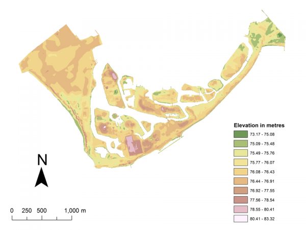
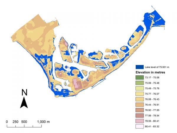
Importantly, these maps show flood risk or vulnerability not the actual extent of the 2017 flooding. Mapping the latter is quite difficult and requires very recent aerial imagery and lots of processing. Mapping vulnerability is more easily done, and important for future planning and mitigation efforts. It involves combining elevation data and lake level data. The flooded areas on the map above are areas with an elevation below 75.931 metres — the highest recorded lake level in the Toronto harbour this May, as measured by the US Army Corps of Engineers. In other words, these are the areas that most likely experienced the worst of the flooding and are most likely to experience it again.
It’s also worthwhile to mention that flood vulnerability — like so many things these days — is data dependent. These maps were made using elevation data created by the Ontario Ministry of Natural Resources and Forestry in 2002 with five-metre horizontal resolution using aerial photos. You can find the data through Ontario’s open data site. Toronto’s open data portal also has local elevation data created using similar methods and re-jigged into something called a triangulated irregular network, or TIN. In an interesting twist, when I mapped the flooding with this dataset the outlook for the islands was substantially worse, and in fact most of Billy Bishop was under water.
So which dataset is to be believed? There’s no way to tell without actually going to the islands and measuring them, what’s called “ground truthing” the data. Better data are out there — like the ridiculously high-resolution lidar data — but are not freely available to the public. One thing is clear: this is likely not the last or worst flooding the Toronto Islands will experience. With the changing climate, Toronto can expect more frequent and severe rain events like the ones this spring, which means higher lake levels and more flooding in the city’s low-elevation areas. Understanding and communicating vulnerability will be vital endeavours for the City and the Toronto and Region Conservation Authority. But making data — making good data, to be clear — open and freely available so that communities can take action on their own can help in reducing future flood vulnerability and in adapting to climate change.

top photo by Sam Javanrouh
map illustrations by James Steenberg
James Steenberg is an environmental scientist and writer. He is a research associate at Ryerson University in Toronto and a Postdoctoral Fellow at Dalhousie University in Halifax. Follow him on Twitter @JamesSteenberg
The post Mapping the flood vulnerability of the Toronto Islands appeared first on Spacing Toronto.