With next year’s municipal vote now less than a year away, the pre-election positioning has begun in earnest – the most recent example being a pitch by the TTC earlier this week to freeze transit fares for the first time in years, as the Toronto Star reported. Expect much more to come.
How the months of candidate jockeying will play out in the city’s neighbourhoods is, of course, the story that will unfold between now and next November. And if history and demographic change is any guide, the outcome – for both mayor and council — isn’t as predictable as some pundits may assume.
The most obvious shift from the previous election is the number of wards: 47, up from 44, provided that council’s new boundary proposal survives a challenge at the Ontario Municipal Board launched by councillors Justin Di Cianno and Giorgio Mammoliti. The redistricting, undertaken as a response to all the population growth in the core, gives the older, and more affluent, parts of the city more clout on council.
Then there’s history.
While many people believe that the city, and council, is chronically divided between the old City of Toronto and the post-war suburbs, the electoral history of the post-amalgamation municipality offers a more nuanced view.
Mel Lastman’s centrist coalition (1998-2003) straddled both regions. David Miller won in 2003 on a base of support that included the old City as well as parts of Scarborough, North York and even Etobicoke. When he was re-elected in 2006, a year not unlike this one economically, Miller swept virtually the whole city.
Rob Ford’s 2010 victory vividly illustrated the old City/suburbs split. But the 2014 election offered a more nuanced result, with John Tory prevailing in the more affluent areas that more or less follow the subway network and Doug Ford winning large swaths of both Etobicoke and Scarborough. As with Rob’s 2010 win, Doug’s base corresponded with those regions that had seen a long-term increase in low-income census tracts over several decades, as documented by the University of Toronto’s David Hulchanski in the Three Cities project (1970-2005).
Using the latest census data, which is current up to 2015, Hulchanski has produced an update of his analysis, which he has shared exclusively with Spacing.
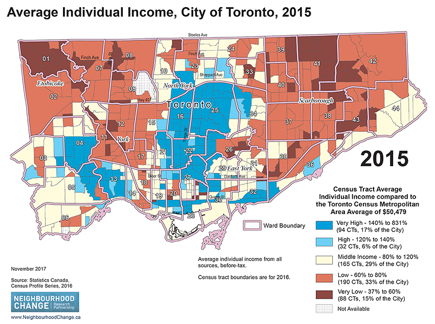
In some ways, the long-term socio-economic and spatial trends identified in Hulchanski’s original study remain in effect. As this map [above] of average individual income for the City of Toronto, 2015, shows, the north-east and –west quadrants continue to be dominated by census tracts where the average income is well below the Toronto CMA average of just over $50,000, while those central and east-west corridors continue to be dominated by those with much higher incomes. Also, while the city is almost perfectly split between white residents and visible minorities (49% to 51%), the latter are disproportionately represented in lower income census tracts.
If we compare 2005 to 2015, some of the rapidly gentrifying areas on the edges of the older core — the Junction or Dundas West — are clearly visible, while areas that have seen an expansion of lower income tracts, such as in North York, are also apparent.
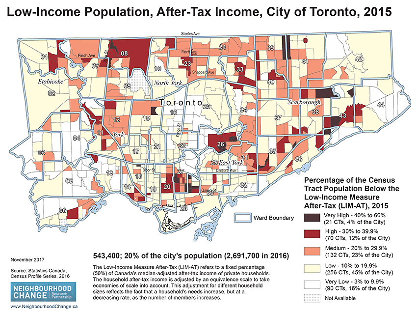
Yet this map [above], which shows the concentration of low-income households within census tracts measured relative to the median-adjusted after-tax income, offers a somewhat less bleak picture of poverty in Toronto. While about 543,000 people, or approximately one fifth of the population, live in households below this threshold (about $56,000), fully 84% of Toronto’s census tracks contain fewer than 30% of such households.
The reason this map is more significant is that it focuses on after-tax income, which is to say the money people actually have to spend. Since the early 2000s, certain federal income redistribution programs, such as the Canada Child Tax Benefit, have gone a considerable distance in improving household incomes at the bottom of the socio-economic ladder, and thus limiting the pull of income inequality and social polarization.
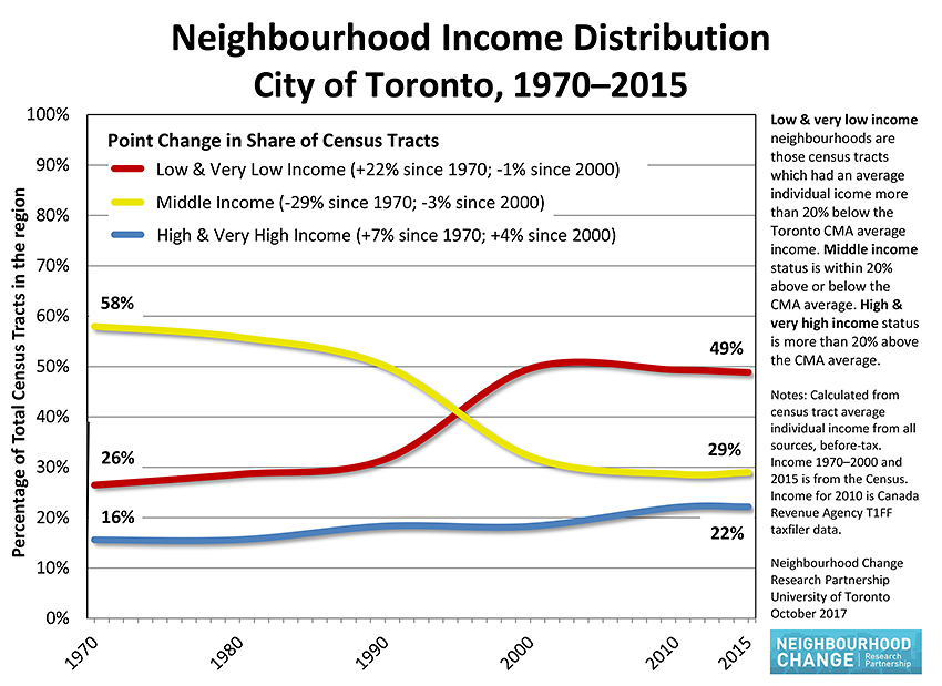
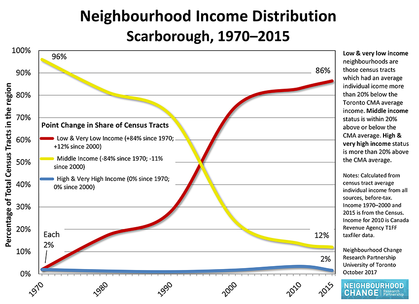
Hulchanski’s research team, in fact, has produced time-series graphs showing neighbourhood income distribution. This graph [above] vividly depicts the long steady decline in the number of middle-class census tracts between the early 1970s and the mid-2000s, along with a steep increase in low-income tracts and a more gradual growth in high-income ones.
But what’s apparent is that the decline in middle-income neighbourhoods seemed to stop about a decade ago, and has even climbed slightly, while the reverse is true for lower-income neighbourhoods. “The trends continue, but at a more modest rate than in the 1990s,” Hulchanski says.
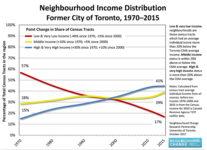
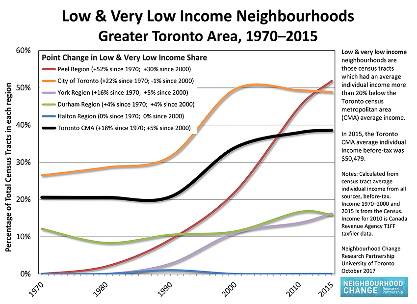
As this chart [above] shows, the old City of Toronto essentially flipped its socio-economic profile between the early 1970s and today, going from predominantly low income to predominantly middle and high income. Scarborough [below], however, had the steeped growth in low-income areas, and an only modest leveling off in recent years.
Hulchanski points out that the ripple-like expansion of lower-income rings now reaches into the 905 municipalities [below], following a trend observed in other large metropolitan regions which have seen gentrification in their core areas pushing lower-income families further and further afield.
What’s the political or electoral upshot of the demographic trends identified in Hulchanski’s research?
It seems clear that the steadily expanding economic hardship predicted in the original “Three Cities” report has slowed in recent years, due to a robust economy, relatively strong employment and various public policy moves. Still, Hulchanski says, governments need to continue to introduce many other targeted interventions to successfully reverse almost four decades of drift.
One might conclude that strident pocket-book appeals will resonate less vigorously next year than they did in 2010, when Ford’s gravy train rhetoric appealed to many lower-income suburbanites who certainly did benefit from services subsequently slashed in the name of budget restraint, but nonetheless felt sympathetic to his promises about high taxes and over-spending.
Yet sharply rising housing and energy costs have almost certainly clawed back many of the after-tax income gains that low- and middle-income families achieved in the 2010s. In other words, politicians who come bearing (illusory) promises of municipal thrift, spending freezes and even program cuts can still expect to encounter receptive audiences when they go out on the hustings next year.
maps courtesy of Neighbourhood Change Research Group; photo by Rick Harris
The post LORINC: Toronto’s demographics and the 2018 city election appeared first on Spacing Toronto.

